Throughout January of 2020 I will be traveling through Europe to experience various cultures. I will visit London, Paris, Lucerne, Venice, Florence and Rome. Here, I will share my two favorite experiences from each city. Follow me on my journey!
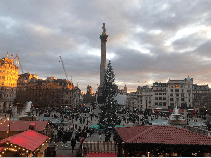
London
Arnolfini Portrait —Jan Van Eyck (1434) —National Gallery
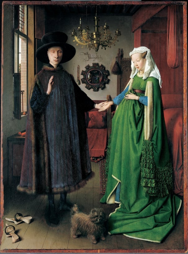
I first learned of the Arnolflini Portrait by Jan van Eyck in a middle school art class. I always remembered the painting because of the mirror in the background. Van Eyck used the mirror to completely recreated the room from the opposite perspective by painting the mirror’s reflection. In one painting you could see the room from two different perspectives, including even the slightest detail. The Story of Art by E.H Gombrich revealed many more details about the painting that I had not initially seen. First, it was important to understand the complexity of the painting and technique required. Van Eyck was a trailblazer in the art world, he introduced the idea that oil could be the medium that binds pigments to the canvas, or in this particular case, the oak panel. This allowed him to create seemingly impossible works of art, including the “Arnolfini Portrait” because he was able to paint slower and with more detail.
The book explains minor details of the painting, for this post I will use the orange on the windowsill, just to the left of the man’s elbow, as an example. The orange is tiny compared to the rest of the work, but still full of detail. This detail includes the orange’s stem, shadow and even its reflection can be seen in the window frame. When you look closely at the mirror you can see that tiny orange’s reflected in the mirror. I first saw this because of an extreme zoom showed in The Story of Art. I knew this was a complex painting, but Gombrich amazed me when he articulated the details of this masterpiece.
I saw the painting in person at Nation Gallery in London. This added another level of admiration. When I saw the painting in person I realized how small each individual brush stroke must have been. The amount of focus and skill required to depict the stem, shadow and reflection of a tiny orange. Then the required skill is taken a step further to recreate the shadow and reflection(on the windowsill) in the mirror’s reflection.
Atlantic Civilisation— André Fougeron — Tate Modern Gallery
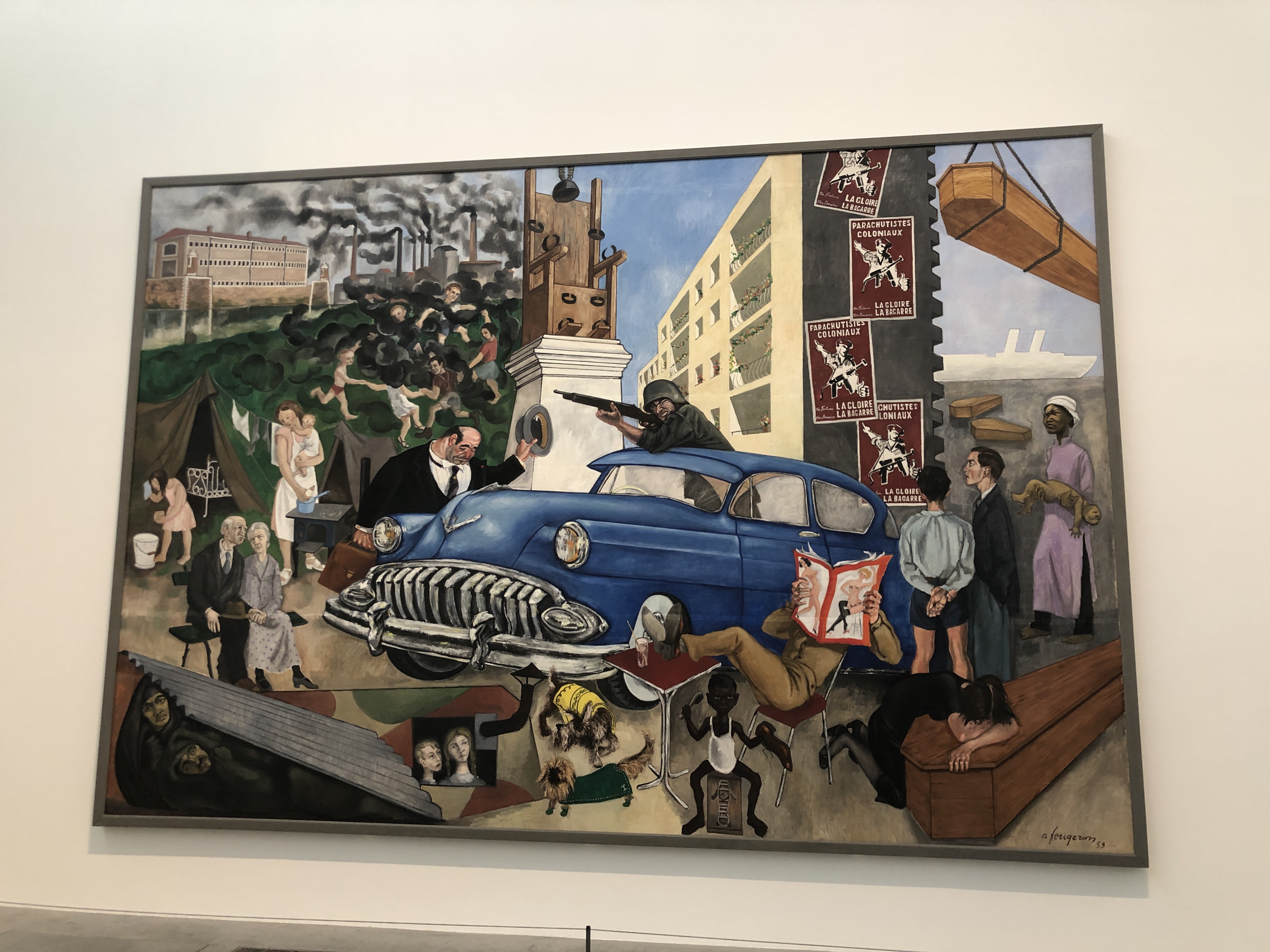
The Tate Modern art gallery displays a 1953 Andre Fougeron work entitled “Atlantic Civilisation.” I was immediately drawn to this painting because of its enormous size and chaos. The painting includes many caricatures, all very different. These caricatures represent a wide array of social issues. This forced me to look closely and slowly interpret the painting section by section. This process felt as if I was decoding a puzzle.
As I scanned the painting I first focused on the top left corner. I could immediately recognize the message. Fougeron depicts a large factory with streams of smoke flowing into a nearby park. The smoke wraps around the park and intertwines between children as they play. I recognized this message so quickly because the issue of industrial pollution is still a prominent issue in today’s society. Through this I formed a connection with the artist. 70 years after the painting was completed, I was able to bond with the artist over a social issue that has impacted both of our lives.
I did some research to “decode” the rest of the painting, luckily the Tate Modern has an amazing website full of information. With such a chaotic painting, I cannot describe every social issue represented in this post. Instead, I will discuss another section I found very relatable. On the left side of the painting, just below the park, Fougeron painted an elderly couple sitting on a bench alone. Their body language gives off feelings of despair and grief. Which raises the questions why is there nobody there to help them, where is their family? I connected with this one because I have seen grandparents on both sides of my family deal with different age related issues. They lose physical mobility, mental capacity and deal with age-related illness. In all of these case my parents, aunts, uncles, and cousins gave overwhelming support. When I first saw the couple, my immediate reaction was that they look like they could use a helping hand, and there was nobody there. This is how Fougeron symbolizes the growing commonality of familial abandonment.
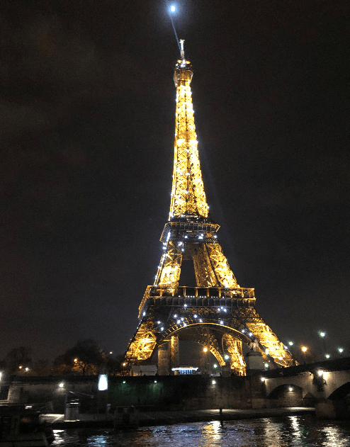
Paris
“Starry Night Over the Rhone” – Vincent Van Gogh —Musée d’Orsay
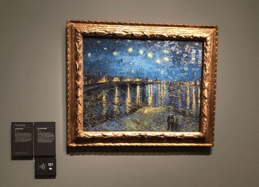
At the Musee d’Orsay I saw the Vincent Van Gogh painting “Starry Night Over Rhone.” Seeing this painting in person was amazing, and I really focused most of my time on a specific section of the painting. My eyes were glued to the water and its reflection of light. Van Gogh’s thick brush strokes and use of the impasto technique added an extra element of movement to the work that I have never seen done, as effectively, before.
The impasto technique adds a texture to the canvas, which allows the thick brush strokes and the variety of dark blues he used makes the painting come to life. The thick brush strokes over the impasto canvas appear to be small waves, flowing into shore and each other. The variety of dark blues add to the movement in a very important way. The small variations in the shades of blue appear to be the natural light from the sky reflecting off the water. This adds movement as well because it helps differentiate each brush stroke as a different wave.
The bright oranges and yellows that show the reflection of the lights from the houses on shore contrast with the dark blues of the water and highlight movement of the waves. The bright colored brushstrokes differ in horizontal length, but can still be traced back to their origin point. These bright brush strokes are occasional overlapped with just the slightest dark blues. This brings the movement to the lights. The combination of the different horizontal lengths and splashes of blue portray to lights and glimmering in the distance. This is where my eyes were drawn and where they stayed.
“Bedroom in Arles” —Vincent Van Gogh — Musée d’Orsay
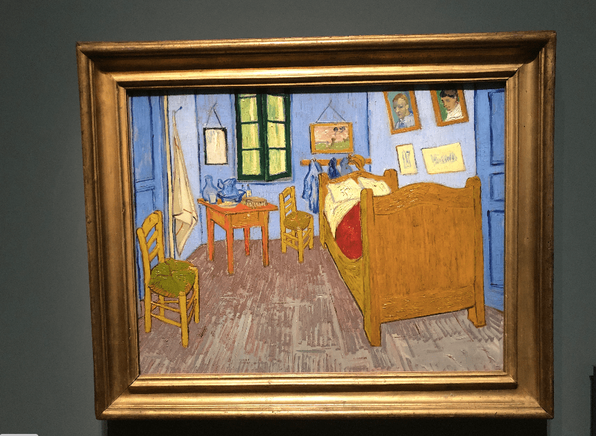
“Bedroom in Arles” by Vincent van Gogh is displayed in the Musee d’Orsay. I was particularly interested in the painting because of a letter I read in E.H Gombrich’s, The Story of Art. The letter is from Van Gogh to his brother that emphasizes his focus on the colors of the painting. It was important to read this letter because it explains Van Gogh’s intentions.
The painting seems to be overly simple and calm. This contrasts with many of the other Van Gogh paintings, which often have an omnipresent element of movement to them. Conversely, “Bedroom in Arles” has elements of tranquility and peace. Van Gogh said in his letter “…to look at the picture ought to rest the brain or rather the imagination.” This shows that Van Gogh’s motive was to create a painting that rested the brain rather than stimulate the brain.
This painting has a lot of Van Gogh signatures such as the distinct brush strokes and the use of color to convey emotion. Van Gogh uses a variety of blues as he paints the doors, walls, cloths on the wall and the water vase. This painting does lack the movement very common in Van Gogh artworks, but still fits into his oeuvre in a complimentary fashion.
Lucerne
Lion Monument
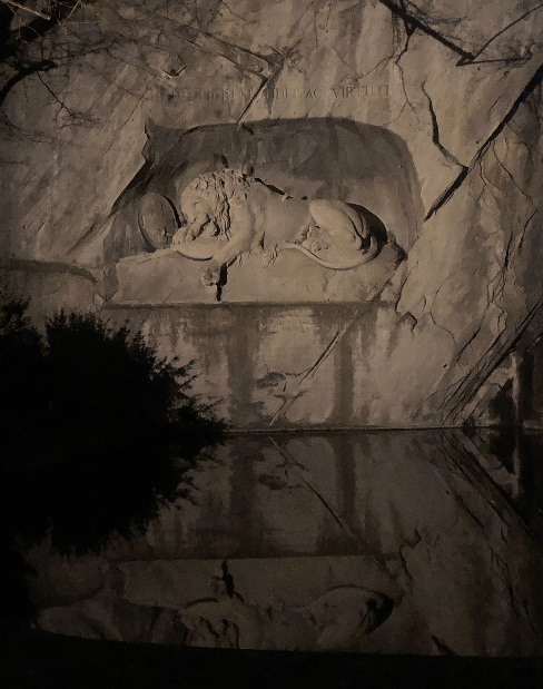
I took a beautiful night tour of Lucerne during the annual festival of lights. This tour included a viewing the amazing Lion Monument on the historic east side of the city. The lion lays on a ledge carved out of the side of a mountain. The end of a spear protrudes out of his side as his front paw hangs off the ledge, while his head lays on a French shield and beside a Swiss Military shield. The lion is hurt and dying, because he represents the Swiss Officers who died protecting the Royal Family of France at Tuileries Palace. Just over the Lion of Lucerne’s resting place, the phrase “HELVETIORUM FIDEI AC VIRTUTI,” which can be translated to “To the loyalty and bravery of the Swiss.” The names of both those officers lost and those who survived are also etched into the rock. This rock relief serves as a beautiful reminder of the people of Switzerland of those they lost.
The view of the Lion at night is amazing. The lion and the rock surrounding the monument are illuminated by bright lights. The lion is a majestic creature and the view of such a large monument, with such great detail drew all of my attention, I couldn’t look away. I am not alone in my admiration; Mark Twain has also very publically referenced the Lion Monument. Twain accredited the Lion of Lucerne as “The saddest and most moving piece of rock in the world.” Twain has also claimed that the lion would be impressive anywhere, but never as impressive as it is in that exact place. I think the Lion fits so perfectly in that spot because of the pond below. The reflection of the monument in the calm water below is almost as intriguing as the monument itself.
Venice
Exterior Mural on the Basilica di San Marco
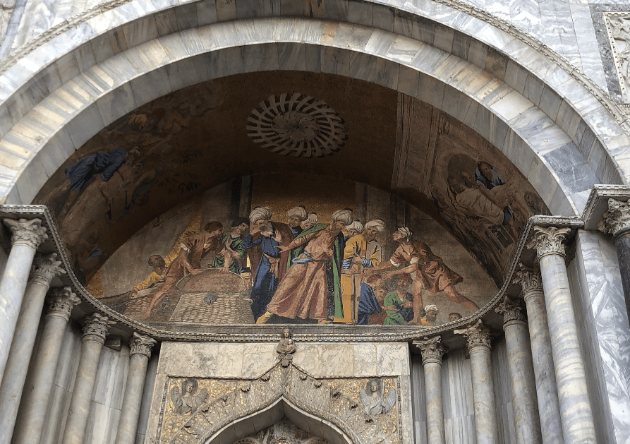
The Basilica di San Marco is an amazing building near the southern shore of Venice, Italy. I was astonished by the building which is covered with paintings and mosaics on both the interior and exterior. I was most interested in a mural on the exterior that depicts how the Venetians acquired the bones of St. Mark. I was impressed by the mural’s ability to explain the story so well.
With some extra research from the Basilica di San Marco’s website, I read the full story and could compare that to the photo I took of the mural. The mural depicts a specific part of the acquisition, the theft. Two Venetian merchants went to worship St. Mark’s relics and bring them to Venice. The men who guarded the relics were Muslim. The merchants developed an ingenious plan which relied on the fact that Muslims are forbidden from eating pork. The Venetians took the body of St. Mark and submerged the bones in baskets of pork fat and replaced his body with a nearby set of relics. The Muslim guards searched the merchants but refused to investigate the baskets of pork fat. The Venetians returned home and the city soon erected the Basilica di San Marco.
In the photo you can see that some men are wearing turbans and some are not. The men wearing turbans are the Muslims and the others are Venetians. A group of Muslims are in the center of the work with Venetians on both sides. On the right a Venetian can be seen with his arms slightly extended and his palms open. He appears to be offering an explanation to the Muslims who are leaning in to listen. On the left you can see a Venetian revealing a basket of pork fat as the Muslims cover their mouths and turn away in disgust. I love this mural because it depicts such an interesting story so accurately, this mural brought the story to life.
Portrait of the Four Tetrarchs outside the Basilica di San Marco
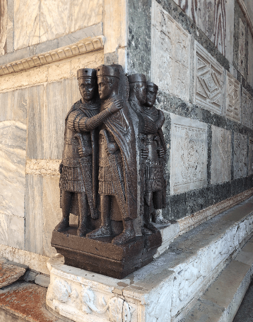
Outside of the Basilica di San Marco is the “Portrait of the Four Tetrarchs.” My attention was first drawn to the statue they seemed out of place. The statue is placed in a corner and the color contrasts with the rest of the building. I researched further because my tour guide joked that they were Roman leaders scared of the Venetians, but my research led me to a different conclusion.
Historians believe that the statue comes from the ancient city of Constantinople. The portrait depicts the four leaders of the Roman Empire and was originally supposed to represent solidarity and leadership. The four leaders of the empire holding each other, with weapons clearly visible. The statue was most likely brought back to Venice in the early 1200s during the fourth crusade. The four all appear very similar with small variations, for example, two of the four are bearded.
After I completed my research I was still very curious as to why the Venetians would attach this portrait to such an important structure. It could have been to symbolize their success in the fourth crusade and the sack on Constantinople. This reason makes sense to me because it’s a can create a spark of interest. Many people may see the seemingly out of place statue and research its meaning. Then, through their research, they would discover an important part of the city’s history, just as I did.
Florence
“The Duke and Duchess of Urbino Federico da Montefeltro and Battista Sfotza” — Uffizi Gallery
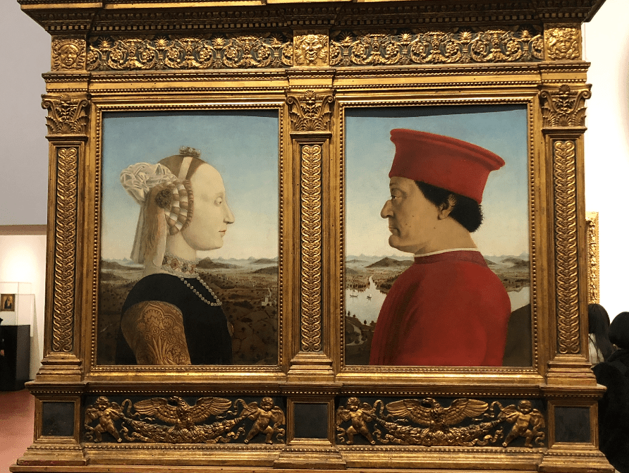
In the Uffizi gallery, I saw an early Italian renaissance painting entitled “The Duke and Duchess of Urbino Federico da Montefeltro and Battista Sforza” by Piero della Francesca. There was a painting on the backside as well, but I will focus on the front side’s portrait. The painting stood out to me because of the level of detail compared to the medieval paintings at the front of the gallery.
Renaissance paintings are known for their detail, but transitioning from a medieval painting directly to a renaissance painting really highlights the differences. On the lake behind the Duke you can see two boats, the detail is so great you can tell which way the wind is blowing by looking at their sails and even see their reflections in the water. I also was able to notice how you can see each individual sparkle on the Duchess’ necklace. This detail helped me realize the strides artists made during the renaissance period.
Their status can easily be interpreted by the title, but also from the Duchess’ jewelry and the fact that the Duke is wearing red clothing. However, my guide at the Uffizi explained to my group that the profile portrayal was supposed to show their status as well. She said that profiles became popular because important figures were portrayed in profile on coins. In addition, the Uffizi website informed me that the profile representation was allowed Piero della Francesca to avoid some of the Duke’s less-desirable characteristics. The Duke lost his right eye in battle and a profile portrait was a way to keep the painting accurate and aesthetically pleasing.
Reference
“The Duke and Duchess of Urbino Federico da Montefeltro and Battista Sforza.” Le Gallerie Delgi Uffizi. https://www.uffizi.it/en/artworks/the-duke-and-duchess-of-urbino-federico-da-montefeltro-and-battista-sforza
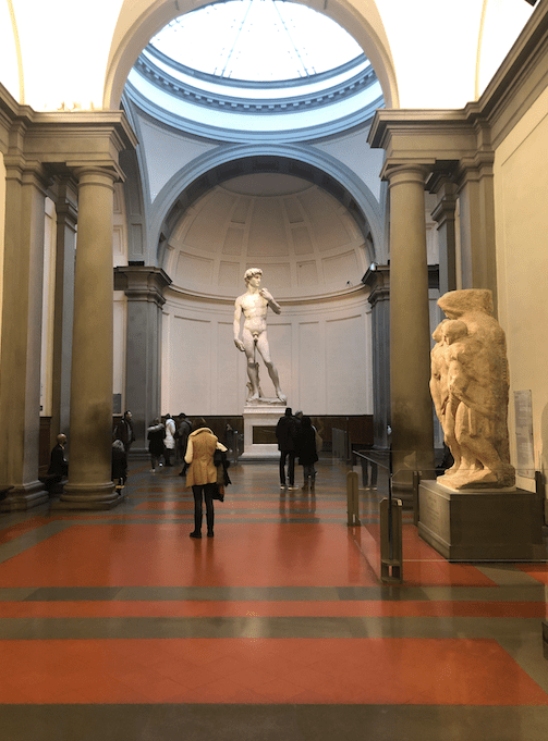
Michelangelo’s “David” — Accademia Gallery
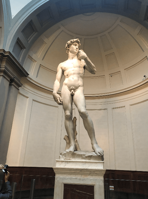
Michelangelo’s “David” is widely regarded as one of the greatest works of art known to man, Giorgio Vasari has even claimed “When all was finished, it cannot be denied that this work all carried off the palm from all other statues…” The size of the “David” shocked me, as I entered the room the statue towered over the surrounding people. The enormous sculpture is also incredibly detailed. The detail in the contours of the muscles, the curls in the hairs, and even the minute details such as forearm veins and kneecaps. After analyzing the detail and size of Michelangelo’s “David,” I engaged in a discussion with my peers over how long we thought this sculpture took Michelangelo. With assumptions of a 40 hour days, six days a week, the estimations ranged from a year and a half to over ten years. The Accademia’s website informed me that the “David” took Michelangelo two years. Two years is a long time, but still an impressive timeline for such a large, detailed statue.
A layman would think that the hands and head may be too large, but my professor and other guides have informed me, the hands and head are that size because of perspective. The sculpture was supposed to be perched on a church, here, the head and hands would appear proportional to the body. “David” was made to be viewed from the perspective of a person on the ground looking up at a church, not a pedestal in a museum. With that being said, I still think the “David” resides in a perfect space. A long hallway leads to a large circular room where “David” is in the middle, this really makes the sculpture the centerpiece of the museum. Natural sunlight shines in through the ceiling and creates the perfect lighting for such a masterpiece.
“Michelangelo’s David.” Accademia Gallery. http://www.accademia.org/explore-museum/artworks/michelangelos-david/
Rome
“Fire in Borgo” by Raphael — Vatican Museum –Vatican City
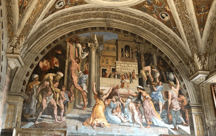
Raphael’s “Fire in Borgo” is a fresco in the Vatican Museum’s Raphael Room named “Stanza dell’incendio del Borgo.” The Vatican Museum is covered with various artworks and in a room full of enormous frescoes, this one in particular stood out. I was drawn to “Fire in Borgo” because of all the chaos, people are scrambling, but I couldn’t figure out why. Once I read the title and saw the flames in the upper left corner, I was able to breakdown the fresco and analyze the work more thoroughly.
When analyzing the painting, I split the painting into three sections; the left half, the top of the right and the bottom of the right half. On the left edge you can see the fire, this fire changed the way I interpreted the painting. The naked man who I though was trying to scale the wall became a survivor trying to escape the flames. The two men in the bottom left were no longer fighting, but instead, a young man was helping an older man escape the flames. Originally the top right was the last part of the work my eyes were drawn too, but after my research I now see it as the centerpiece. Here, Pope Leo IV can be seen extinguishing the great fire. In the bottom right, a strange conflict of chaos became women pleading to the Pope and praying.
Scholars criticize this fresco because it lacks proportion, narrative and structural coherence. Considering the differences between my initial impression and my educated understanding of the work these are fair criticism. I definitely think that more attention should be drawn to the Pope Leo IV. It is important to point out that this fresco came from Raphael’s workshop, but it is widely believed that it was actually painted by his assistant, Giulio Romano.
Reference
Reilly, Patricia, L. “Raphael’s Fire in the Borgo’ and the Italian Pictorial Vernacular.” The Art Bulletin. Vol. 92, No. 4, December 2010, pp 308-325.
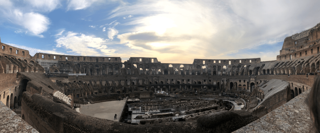
“The Colosseum” by Renato Guttuso — Vatican Museum — Vatican City
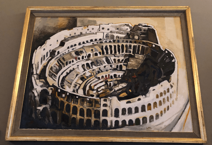
“The Colosseum” is a 1972 oil painting on canvas by Italian expressionist Renato Guttuso. This painting was gifted to the Vatican Museum by Guttuso and still hangs there today. I went to closely look at the painting because I had just been to the Colosseum the day prior. The painting’s version of the Colosseum resembled the version I had seen. The top level walls were crumbled along with the seats surrounding the center, the trap doors and cells underneath were exposed. Even though it was similar, the painting was not intended to perfectly recreate the structure. Guttuso used the colors black and red throughout the work. These reminded me of the stories I had heard of the Colosseum and its purpose. The red represented the blood of the gladiators and animals that participated in the “games.”
As I researched Guttuso and found he was an expressionist, I thought that was the meaning he was trying to portray, but I also developed an alternative theory. Guttuso was a known an active member of the communist party, which was often symbolized by the color red. Guttuso was born in Sicily, but spent a considerable amount of time living in Rome and lived there when he painted this (1972). The theory is that Guttuso took a part of his home city and put a personal twist on it. The Colosseum is a part of his home and the personal twist is the communist party represented through use of red.
Reference
Biography Renato Guttuso Website. https://www.guttuso.com/biografia/?lang=en
